4.02.2008

update #2: political posters, sans politicians

I've gotten tired of the glossy image presented by politicians. I don't care if you sweat under the stage lights during a debate. I don't care if you're not very attractive. I don't care if you're black. All I care about are your views and your plans. So here's my attempt to get you to care about that too, or to at least cater to the priorities of people like myself. Each is based on the candidate's own words, and gives a brief summary checklist of their stances on other major issues at the bottom.

These were made for each of the (at the time) leading candidates on both the Republican and Democratic sides of the fence. I'm too lazy to post them all.... but these two got some of the best reactions, primarily because people in Seattle are very concerned about the environment, and it seems that most people don't realize quite how ridiculous Fred Thompson is.

updates on my work, part 1

sooooo, since it's been about forever since I've posted, I've decided to do a series of posts of my work, to document and explain, and well, just get it on out there! Comments, questions, and critiques are all appreciated. I'll start with myfall work in information design.
As a class, we were given the topic of energy to explain through information graphics. We started by researching everything we could about energy- facts about coal, nuclear energy, solar power, wind power, hydroelectric power, and overall energy cons
umption were collected and poured over. Of course, the thing about energy that interested me the most was the part least talked about- the delivery of energy. Of course, I was in LA for rolling blackouts, so maybe that had something to do with it. Everyone was talking about how energy was produced, and how energy was used, and not thinking about what came in between. So the following was my attempt to explain that in-between stuff in the space of three magazine spreads...


So, there are some things about this that I'm happy with, and some that I'm not so happy with. And apparently, this is a consensus, as I was listed as a finalist in the Eyebeam Eco-Vis Challenge. 

Next up: political posters, without politicians.

10.24.2007

Art Chantry @ the Henry

First of all, I must apologize for the lack of posting in the last month or so. I have been crazy busy settling into a new place, learning, working, and playing. I've had several things I wanted to blog about in this time, but it never seemed to happen. Tonight however, I went to a lecture that inspired me so much that I couldn't keep it to myself.

Tonight I stopped by the Henry Art Gallery to see local designer Art Chantry speak about his work. He hadn't really been on my radar before, and when I was deciding whether to attend or not I was frankly a little put off by the fact that most of his work is in advertisement. I admit to a bit of snobbery when it comes to slogging product, but this guy managed to rock my world anyway. What was so amazing? Authenticity. There is so little of it in the world, and Chantry has it in spades. Why shoot a TV and then take a picture of it, when you can take a picture of it and shoot the picture? Why put flames on a poster, when you can set the poster on fire? Why declare yourself to be Swiss when you're really a punk at heart? For the first time I see with 100% clarity that the abstract and undefined ideas that have been floating in my head do have a place in this industry, that I have a place in this industry. This man stepped up to the podium and he was tattooed, he was crass, he was unapologetic about his ugliest work, and I was amazed, because it's far too easy to become obsessed with making things look good at the expense of authenticity and experimentation and your own real self. Now, I'm not ready to run off and be a little disciple or anything, because that would only be imitation, and be as plastic and slick as the Swiss disciples, and I'm not particularly punk anyways.

But I guess what I'm trying to say is this: thank you Art, for a magical evening. You really opened my eyes.

9.20.2007

Moving, TA Training, Orientation.... information overload!

So, I will be starting the MFA in Visual Communication Design at the University of Washington next wednesday. This past weekend, I packed most of my posessions in my Jetta and drove it 17 hours north to start a new life. I went from summer to fall in under a day, from warmth to rain and chill, from architecture to graphic design, from the working world back to school, and from the known into the unknown. More images of my neighborhood, my school, and my studio work, will come in time, but for now I thought I'd post some observations gleaned from the information overload that has been the past four days:

*Never ship anything you really care about, unless it is nigh indestructable.
*"Do not beat up your students"!!! (yes, this is an actual quote from my TA Training conference. I don't know how the seminar took this turn, but once it had it was hard to get back on track)
*Even grad students have a hard time with some very simple things, like course registration.
*The bus system here really IS better.
*A Volkswagen Jetta can fit approximately one room worth of posessions, plus up to three bicycles on the back when outfitted with the appropriate rack.
*I'm not the only one too poor to afford the MacBook Pro they really want...
*I need sweaters. LOTS of sweaters.
*Even when it's cold here, it's really, really beautiful.

9.06.2007

Seattle Parks - Freeway Park

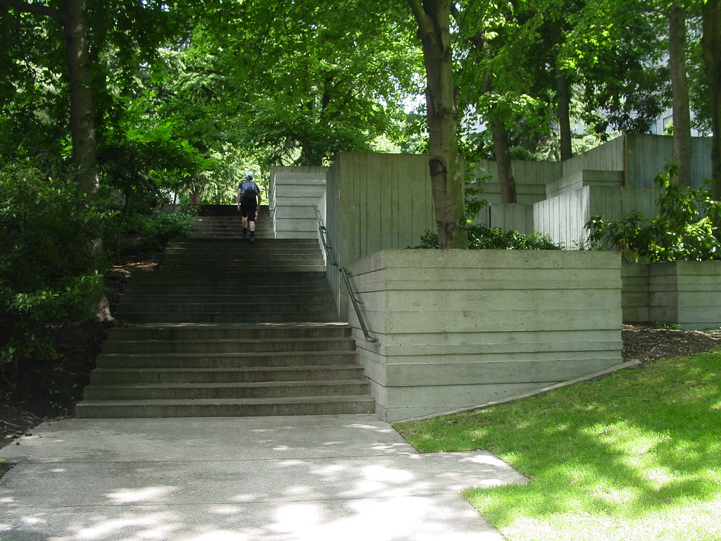
This is post #1 in the Seattle Parks series. Freeway Park is a hidden gem in the midst of downtown Seattle, designed by Angela Danadjieva. A concrete 'lid' has been constructed on top of a portion of I-5, and populated by walkways, plants, and fountains. This hidden gem is a great example of the character of Seattle itself, with the large expanses of concrete directly bordered by verdant landscape. It is full of interesting textures, beautiful dappled light, lunching workers from nearby corporate towers. I don't blame them --- if I worked downtown I would lunch here, too. Full photoset can be found on Flickr.

9.02.2007

notes on biking in Seattle


So I was in Seattle a few weeks ago, and meant to do a series of Seattle posts right when I got back, but, well.... you know how it goes. Anyways, two great things about the above image: first, the bike parking was pretty nice. Apparently these used to be parking meters, but the metering on that street was replaced by a single electronic meter that serves the whole street. So instead of ripping out all the old parking meters entirely, they just chopped off the tops and added these cute bicycle symbols, that cyclists can lock to. Being convenient, good-looking, obvious, and based on the principle of re-purposing existing infrastructure gets this bike rack major props here. The only downside was that they were only good for one or two bikes.


Great thing #2 about the above picture: that's a rental bicycle! That's right, the great folks at Montlake Bicycle Shop hooked me up with a very nice rental bike for a few days. I got several compliments on it, everyone was suprised that it was a rental. I completely recommend renting a bike as a great way to see the city- you're not at the mercy of the bus schedule, and you get a better view of many of Seattle's natural wonders than either pedestrians or motorists do. Plus, all that exercise lets you try tasty treats from Pike Place market guilt-free! So all in all, it was a great trip and I logged in lots of miles. I hope to post more later, particularly about some of the parks I saw there.

7.29.2007

toxic algae

A trip to the beach (on two wheels) yielded the a strange and unsightly water condition that seriously discouraged swimming. Each wave crest was green. Violent, acid green. Green ripples were left on the sand where the water had receded. Flotillas of the same green material abounded on the water, looking like rising yeast which had met an unpleasant food coloring. A lifeguard told us that this presence was an unusual amount of algae in the water due to warmer than average water temperature. A look at the Ocean Advisory and Beach Recreational Health page yields the information that Venice Beach's water quality grade for this month is indeed a C, with a symbol indicating that this does not meet acceptable standard.

Big suprise. While the lifeguard on duty was quick to assure that this was nothing to be worried about, my scalp and skin felt coated in slime after my hasty exit from the water, and I can't help but think that when someone has algae in their pool, they don't take a swim in it.